Have you walked into a room and felt like something wasn’t quite right? Maybe the furniture felt cluttered, the lighting gave you a headache, or the artwork felt like it was floating in outer space. Many of these issues stem from a few common decorating mistakes that are easy to overlook and can throw off the entire vibe of a space.
The goal isn’t to follow a strict rulebook or make your home look like a museum. It is about creating a space that feels comfortable, functional, and authentically you. Often, achieving that “put-together” look is less about buying expensive things and more about placement, proportion, and avoiding a few simple errors.
The good news is that most decorating blunders are easy to fix, or even better, easy to avoid before you spend a dime. Let’s walk through the most common decorating mistakes homeowners face and how to sidestep them so you can confidently create a space that feels balanced, functional, and uniquely yours.
The “Rug Island” Phenomenon
One of the most common decorating mistakes is choosing a rug that’s too small for the room. A rug is the foundation of a room; it anchors the furniture and defines the zone. When you place a tiny rug in the center of a room with furniture floating around it, the room feels disjointed and smaller than it actually is. It creates a “rug island” that no one wants to visit.
Instead: Go Big
Your area rug should be large enough that at least the front legs of your sofa and chairs sit on it. This anchors the furniture and creates a cohesive “zone.” If you have a large room, go bigger: an 8×10 or 9×12 rug is often standard for living areas. Measure your space before you click “add to cart.”
Relying Only on Overhead Lighting
Lighting sets the mood. If your only source of light is a single, bright bulb in the center of the ceiling, your room will feel stark and uninviting. It creates unflattering shadows and offers zero ambiance. This is often called the “interrogation room” effect.
You can have the most beautiful furniture in the world, but if the lighting is bad, the room won’t feel right.
The Solution: Layer Your Lighting
Aim for at least three sources of light in a room to create depth and warmth.
- Ambient: This is your general overhead light.
- Task: Targeted light for reading, cooking, or working (like desk lamps or under-cabinet lights).
- Accent: Soft light that highlights features or adds warmth (like wall sconces or table lamps).
Put everything on dimmer switches whenever possible. This simple upgrade gives you total control over the mood of the room.
Picking Paint Colors First
It is tempting to start a room makeover by choosing a paint color. Paint is transformative and relatively cheap. However, picking a specific shade of “Sage Green” before you have chosen anything else paints you into a corner; literally.
There are thousands of paint colors available and they can be mixed to match anything. Fabrics, rugs, and artwork are finite. It is much harder to find a sofa that perfectly matches a wall color you already painted than it is to find a paint color that complements your sofa.
Try This: Choose “Bossy” Items First
Choose your fabrics, rugs, and major furniture pieces first. Once you have those key elements, pick a paint color that ties them all together. Always test paint swatches on your wall and look at them at different times of day. Natural light changes everything.
Pushing All Furniture Against the Walls
Pushing all furniture against the walls is a surprisingly common decorating mistake that disrupts conversation and flow. This is a default setting for many people. We think pushing the sofa against the wall maximizes floor space in the middle. While this might be true for a dance floor, it is terrible for conversation. It creates a “waiting room” vibe where everyone sits far apart, shouting across a vast empty space.
Instead: Float Your Furniture
Pull the sofa and chairs away from the walls to create an intimate conversation area. Even just a few inches of breathing room behind a sofa can make a space feel airier. If you have a large room, use the furniture to divide the space into different functional zones. Use a console table behind the sofa to anchor it if it feels weird having the back exposed.
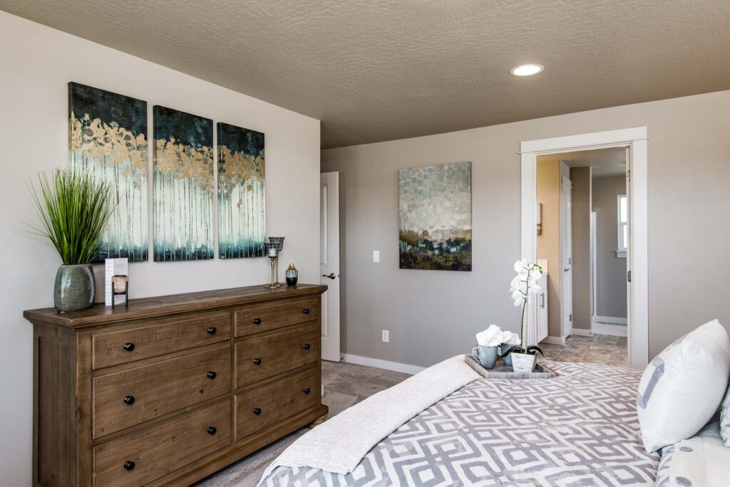
Hanging Art Too High
Hanging artwork too high is one of the most common decorating mistakes and one of the easiest to fix. We tend to hang art where we think it “looks high enough,” which usually ends up being closer to the ceiling than eye level. If people have to crane their necks to admire your artwork, it is hung too high. Art that floats near the ceiling feels disconnected from the furniture below it, disrupting the flow of the room.
The Solution: Eye Level is Key
The general rule of thumb is to hang art at eye level. This means the center of the piece (not the hook) should be about 57 to 60 inches from the floor. If you are hanging art above a sofa or console table, aim for the bottom of the frame to be 6 to 8 inches above the furniture. Treat a gallery wall as one single unit and center the whole grouping.
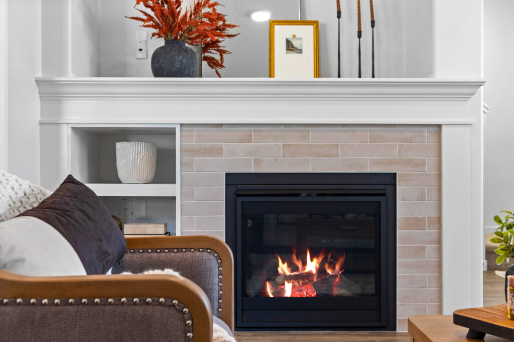
Ignoring the “Rule of Three”
Why do some vignettes look effortless while others look like a pile of junk? It usually comes down to grouping. Our brains are wired to find odd numbers more visually appealing and memorable than even numbers. Even numbers create symmetry, which can feel stiff and formal. Odd numbers create interest.
Try This: The Magic Number
When styling a coffee table, bookshelf, or mantel, group items in threes (or fives).
- Vary the height: Don’t put three items of the same size next to each other. Use one tall item (like a vase), one medium item (like a picture frame), and one small item (like a candle).
- Vary the shape: Mix a vertical object, a horizontal object, and a rounded object.
For example, on a coffee table, try a stack of books (flat), a plant (organic/tall), and a decorative bowl (round/low).
Hanging Curtains “On the Frame”
Window treatments are expensive, so it is painful when they don’t look right. A very common decorating mistake is buying curtain rods that are the exact width of the window frame and mounting them right on the trim.
When curtains hang this way, they cover a significant portion of the glass even when open, blocking natural light. It also clearly defines the window’s size, which, if your windows are small, emphasizes their smallness.
Instead: Hang High and Wide
You want to trick the eye into thinking your windows are huge and your ceilings are soaring.
- Go Wide: Extend your curtain rod at least 6 to 10 inches past the window frame on each side. When the curtains are open, they should rest against the wall, barely covering the glass.
- Go High: Mount the rod closer to the ceiling than the window frame. A good rule of thumb is halfway between the top of the window and the ceiling (or crown molding).
Buying Without Measuring
The “eyeball” method is the enemy of good design. You see a coffee table you love, assume it will fit, and bring it home only to realize it dominates the entire room. Buying furniture that is too large makes a room feel cramped, while furniture that is too small makes it feel like a dollhouse.
This is a logistical nightmare. Nothing is worse than paying a restocking fee for a sofa that never made it inside your house because it didn’t fit through the door.
The Solution: The Tape Measure Trick
Measure everything. Measure your room, but also measure your front door, hallways, elevator, and stairwells.
- Map the footprint: Use blue painter’s tape to outline exactly where the new piece will go on your floor. Have carpet? Consider using butcher paper!
- Check the flow: Walk around the taped area. Is the path clear? Can you open drawers and doors fully?
- Check the depth: Check the diagonal depth of sofas to ensure they can pivot around tight corners.
Creating a Home You Love
Avoiding these common decorating mistakes isn’t about following strict rules; it’s about making your home work better for you. Decorating is a process, not a race. Take your time. Live in the space. See how the light changes and how you actually use the room.
When you focus on scale, lighting, and functionality first, the aesthetics tend to fall into place naturally. Don’t be afraid to experiment, but keep these fundamentals in mind to save yourself time, money, and headaches.
Ready to build a new home? Simplicity by Hayden Homes offers beautiful, affordable new homes built on your land in Washington, Oregon, and Idaho. Explore our home plans to see how easy it is to build your dream home.